Automotive advertising has always been particularly creative. It is also big business with the top companies such as General Motors spending over $3 billion USD per year on advertising. With so much money at stake, its no wonder that automotive banner ad campaigns are often so exciting and clickable!
We’ve put together 10 examples of automotive banner ad campaigns to show you how some of the biggest spenders in advertising do it and whether or not they’ve got it right!
1. Volkswagen Rabbit
Here’s a great interactive automotive banner ad from Volkswagen. Viewers are invited to type in commands for the car and it will do it! This is a really fun way to keep views on your automotive banner ad, and to get media coverage because it is so unique. However, one downside of this automotive banner ad is that it is created with Adobe Flash, meaning that viewers using mobile devices would simply not be able to view it and miss out on all the fun!
Click to try out the ad for yourself
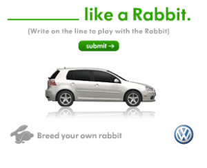
Credit: Volkswagen, found at Digital Synopsis
2. BMW- The Longest Banner
This automotive banner ad goes against everything in the design book! It is long, text based, lacking in colour and with no call to action, so why have they created it? The idea behind the banner is that the SUV can take you anywhere, and in this case it can take the reader on a 5500 word journey. Personally, I think this ad is more gimmicky than effective. I think most would miss the point of the ad because no one has time to read so much text. Its unique for sure, but I wouldn’t recommend it.
Click to see the full automotive banner ad!
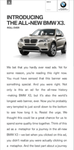
Credit: BMV, found at BannerBlog
3. Mercedes E-Class Estate
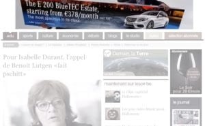
Dubbed as the ‘transportable banner’ this automotive banner ad from Mercedes really blurs the line between traditional banner ad and video banner. The idea behind the ad is that Mercedes wanted to show how spacious their car was, but felt restricted by the size of banners. This car banner ad shows two guys literally tearing the banner ad from its frame and then putting it into the back of the car. What is great about this ad is that it gets its message across and it is truly unique. Although the design is fascinating, the call to action is not displayed until the end of the ad, forcing the viewer to watch the ad before they know what to click on and where it would take them to. Remember that your car banner ad should be used as a tool to sell, and get people to your website, it should not just be a piece of art!
This ad was also very difficult to produce as the creators, agency DDBO explain:
“Each size had a specific script because the banner that goes in the car, has a shape and size according to the different banner sizes. So we had to come up with four different ways to fit it in the E-Class and make it appear as big as possible”.
See the video explaining the automotive banner ad here
Credit: Mercedes, found at AdRants
4. Volkswagen GTIMkV burnout
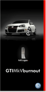
This automotive banner ad from volkswagen is wonderfully addictive as it invites viewers to ‘hit the gas’ and try to burn out the tyre. There is a great use of animation in the wheel rotating and with additional smoke effect – giving the feel that you’re really in an action film! The design is clever, simple and displays the car well on a dark and moody background. However, there is little more information on the banner. There is no call to action or information about a promotion. It’s difficult not to wonder- what should I do next?
Credit VW, found at BannerBlog
5. Nissan House-hunter Test-drive
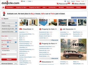
This is possibly one of the cleverest and well-thought through banner concepts I’ve recently seen. In their banner campaign targeting expats in the Middle East, Nissan really demonstrated how data and knowing your target market can be used to create relevant advertising.
Nissan found that for expats two of their biggest challengers we to find somewhere to live, and a car to drive, so Nissan partnered with a large house search website to advertise their banner on. The used the data input on the house website to match people searching for houses to a car that would fit their lifestyle and budget. Further, viewers could book a test drive to their house viewing in the car of their choice. This campaign goes to show that advertising goes beyond the banner ad.
Credit: Nissan, found at Banner Blog
6. Cadillac Dealer
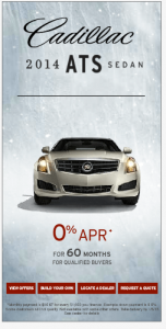
Whilst this automotive banner ad for a Cadillac dealership has made the car the central to the banner design. However, our eyes are distracted by the sheer amount of other text and buttons on the banner. At the bottom of the banner there are four call to actions that lead to different landings pages. Whilst this effect can be used to increase the click-through rate, here it has not been done so well. The buttons are too small and crowded with too much text. There are also some terms and conditions on the bottom of the banner which are simply too small to read, and would be better placed on their website where visitors could easily accessible. Sometimes less is more, and more is just too much!
Found at Moat
7. VW The Fastest YouTube ad
VW have combined Youtube pre-roll ads and banners with the video to create a fun campaign that viewers will just want to click. VW have used the concept that Youtube viewers don’t like to sit through the pre roll videos before the video and just want to skip them. So VW created an ad that is too fast to click. Of course, they follow up this ad with a static banner within the Youtube video for viewers to click through to the website. Although the design of the ad is nothing particularly remarkable, the concept is. VW clearly wanted show how quick their car is, whilst using reverse-psychology to get viewers to clickthrough, genius.
8. Subaru Counting Cans
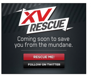
The idea behind this campaigns is that we need rescuing from the everyday mundane with a cool car. The banner invites you to click to count the cans. I admit, I sat there and counted 107 cans waiting for something to happen. When it did it was a total anti climax. I personally don’t think this banner is a success. I think it looks too much like a spam banner from the 90s and its message isn’t clear from the offset.
Credit Subaru, found at BannerBlog
9. VW Truck Game
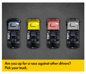
Another interactive banner campaign from VW, this time advertising their trucks. Here viewers are invited to race trucks around a classic race track. Unfortunately, this banner ad misses the mark in many ways.
Firstly, there is next to no branding on the banner- VW is a known and recognised brand, so why hide it? Second, the game gives a birds eye-view of the racetrack, and therefore you cannot clearly see they your are racing a truck, and VW here are missing a chance to showcase their products clearly on their banner. Third, the game is too hard for a banner, and the banner in this example is far too small- viewers are more likely to become frustrated and give up on the game, rather than want to play it again and again. It also feels like this ad does not target the right audience as the average person surfing the web does not want to by a large industrial truck.
Credit: VW, found at BannerBlog
10. Nissan Pulse Jam
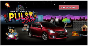
This banner combines interactivity with social sharing to create a unique campaign. It originally was placed as a masthead banner on Youtube, a and invited users to play a simple, yet hard to master game. When the game is over you can share your score on the major social media output and of course go the website to view the details of the car. This is a great way to get people to come back to your website as they try to beat their friends score, and to boost you reach with social media sharing.
Final Thoughts
From diverse range on automotive banner ads we have learnt several things:
- No matter how big your advertising budget is, sometimes you can get things wrong.
- Your banner advertising campaign can and should go beyond the banner to make the whole experience more unique.
- Interactive banners can be a real asset when made well.
- The car, should always be the focus of your banner.
- Sometimes traditional design can work better than trying something totally new
Let me know what you think: have these companies got their banner design spot on? Or have they totally missed the point? I’d love to hear your thoughts in the comments below.
Trademarks, service marks and copyrights in the ads are property of their respective owners. Any offers, promotions, or prices may not currently be valid and are for informational purposes only.

