The humble landing page should be a priority. It’s a critical point in the sales funnel where you either convert or don’t. Getting customers to click-through thanks to brilliant banners means nothing if your landing page fails to do its job. To be blunt, getting visitors to convert can be a challenge and avoiding abandonment should be a key strategy for advertisers.
Keep in mind a landing page is any web page that appears when a visitor clicks on an online ad. It’s also usually designed to guide visitors to an intended conversion goal through an offer. But what are some of the spectacular ways to fail at producing a decent landing page? And how can we learn from these mistakes and avoid them in the first place?
1. Directing all traffic to your homepage
Yes, it’s easy to drive all traffic to your glossy homepage but long-term this method yields fewer leads. For each call to action (CTA) you should produce a tailored landing page. According to Hubspot, businesses with 31 to 40 landing pages got 7 times as many leads than those with only 1 to 5 landing pages. Given these numbers, it seems only logical to create a series of tailor-made landing pages.
2. A call to action that’s vague or one of many
You need a call CTA that serves a distinct purpose. It is after all what you want your visitors to do! It could be: shop now; sign up; try it; contact us, etc. Having CTA copy that has no clear purpose matters – you want people to convert! Be clear and succinct. This means thinking about the location of the button too – it should be the focus of the page and where you drive the viewer.
Another thing, multiple CTAs are a big no. According to the Kissmetrics blog having a single CTA and not distracting viewers with lots of other requests is a key to success. The best pages have only one CTA.
3. Copy that says nothing
Bad copy is a turn-off but copy that says nothing is even worse. Imagine clicking-through from an ad only to land on a page that provides little info. Frustrating, right? A simple way of making sure that you have good copy is to describe what the benefits of the offering are. Consider the problem that your product or service solves. Plus, by zeroing in on what the value proposition of your offering is consumers have a clearer path to conversion.
Also, make sure the tone of the copy on the landing page matches that of the ad it’s synced to. Any headline must always correspond to the ad that trigged the click and be benefit focused too. Plus, remember keep your copy concise! Don’t drift away from the focus of your landing page’s CTA.
4. No one can read your rubbish copy either
It might be that you have good copy but factor in a messy layout and text that is incompressible and you’re onto a loser. Nathan Chan, on Entrepreneur.com writes that “landing pages aren’t the place for poets and literary masterminds. You want your copy to sound good [but] the most important thing is to ensure it gets read, and that’s all about scan-ability”. A practical way of addressing this is to use a legible font and to embrace a logical page structure.
This also means you should remove any extra clutter – links, menus, buttons – that have zilch to do with your campaign. The goal is that a visitor can’t ignore your message by navigating away, and therefore focuses on only the page’s message.
5. Your images are just the worst
Remember, the images and graphics your landing page uses are essential. Random branding images or unrelated content won’t work. First and foremost, your graphical and image choices should be relevant and focused on what campaign is offering. It could be as simple as making sure the colour of your CTA button works with your brands colour scheme. Or even showing an image that is in keeping with your ad campaign.
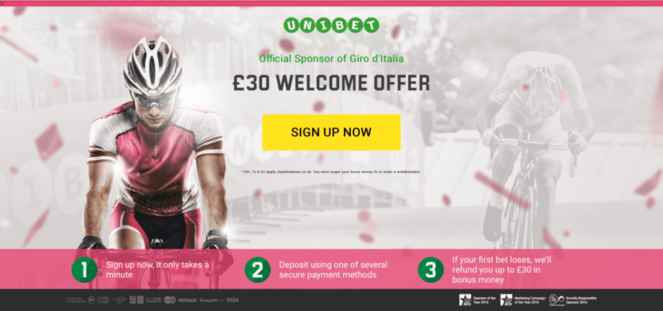
A good example of using images correctly can be found in the Unibet landing page below, which offers a special offer for new users. It’s brilliant. The foreground and background images both relate to the Giro d’Italia, a major cycle tour. Plus, the colour scheme uses pink – the same colour as the leader rider’s jersey. The images, structure, and concise copy combine to make an effective landing page.
6. Not testing before launching
If you don’t bother to test your landing page, then don’t cry when it performs awfully. Prevent this by clicking all the links and making sure tracking scripts are in place. Do this and once the campaign is live, the landing page will function like it’s intended. Amy Bishop of Search Engine Land provides a neat break down of all the things you need to test.
According to Bannerflow Product Manager, Fredrik Lindberg, fail to test and “you’ll spend time and money on fixing things. Your potential customers will get a bad experience – and experience is crucial if you want to convert.” By using a platform like Bannerflow, which offers a showcase feature for landing pages, testing is easy. Edit and adjust landing pages before a page is live, and before you’ve made a bigger mistake.
7. You don’t bother optimising
Don’t expect to release your landing page and assume it to be the finished article. In today’s market if you’re not optimising, you can be sure a competitor will be. Don’t settle for second best. Use methods such as A/B testing to improve conversion rates. Remember data is your ally, collect and apply it when optimising. Use pervious interactions with customers to build effective landing pages that perform. Take a look out on the ad-tech market too. There’s now a range of tools that allow for greater optimisation of your landing pages.
8. Not tracking the right things
It’s ok optimising but if you haven’t set up the page correctly then effectively you’re guessing what to improve. Use analytics to track conversions and page views. Do this to gain insight into what to optimise, and whether your landing page is working (or not).
According to a recent eMarketer survey 75% of North American B2B marketers measure using marketing automation. While it’s 68% for European marketers. The majority of marketers are tracking landing pages. The lesson: don’t be among those that don’t.
9. A landing page that doesn’t translate
It’s obvious but if you want to be successful in multiple markets then provide a landing page in the viewer’s native language. Not reaching potential clients in their native language is lazy and easy to avoid but still many brands fail to recognise this.
In today’s interconnected world, effective translation is an asset. Plus, the number of tools and services providing easy translation is growing all the time. It doesn’t matter which industry you’re in, whether it’s e-commerce, iGaming, or finance, talking the language of your customers should be a priority.
10. A random URL which looks like spam
We’ve all done it. Clicked-through from a display ad only to suddenly see a scary looking URL appear in the search bar and manically click back. Sounds pretty obvious but if someone thinks your URL looks like spam they’re going to bounce. The best practice is to have a landing page URL that is recognisably connected to your brand. This is especially true if you are using subdomains hosted by third parties.
11. Never updating your landing page during a campaign
If conditions change you need to be able to update your landing page. If a campaign isn’t performing, or if the promoted product changes, sitting back and doing nothing doesn’t cut it. You need to have the ability to adjust in real-time, seamlessly. It’s terrible user experience if a consumer clicks-through for an advertised promotion only to find out it’s no longer active. Use a platform, like Bannerflow, which allows you real-time control and the ability to offer an alternative.
Make sure you have fall-backs options in place for deactivated pages too. You need to be able to deactivate landing pages, and reroute click-throughs to active pages. This could either be the homepage, or another landing page. The result: traffic isn’t lost and clicks end up somewhere useful and not a dead end.
12. A landing page that doesn’t support all devices
Failing to make sure your landing page is compatible across devices is poor form. For a start Google sets a premium on responsive landing pages, and mobile now accounts for nearly 54% of all web traffic. Google even provides a service called the “Landing pages” page which finds “the pages that get a lot of clicks, but aren’t mobile-friendly”. Making sure your landing page is responsive is an easy win. It means converting more of your ad click into sales. It shouldn’t be a spectacular fail.
Conclusion
To convert ad clicks into conversions it is essential that you avoid mistakes and produce functioning landing pages. While a lot of the mistakes listed may seem easy to avoid, a surprising number are often overlooked before it’s too late. The fact is producing landing pages is easier than you think but step one is having the right tools. Use tools like Bannerflow’s landing page builder, and you have the potential to produce spectacular landing pages – rather than spectacular fails.


