Improving banner ad design is crucial if you want to improve your click-through rate. Business Insider formulated some statistics about banner ads including that you’re more likely to survive a plane crash or give to birth twins than click on a banner ad. Poor banner ad design is often to blame for a poor click-through rate. If you improve banner ad design you can prove these statistics wrong, and achieve a higher click-through rate!
Most advertisers do not know how to optimize and improve their banner ads and therefore fail to achieve their campaign goals. However, you can easily get ahead in the game by following our 4 ways to improve your banner ad design.
1. Improve Banner Ad Design with a Defined Purpose
Credit: Brand awareness example WWF, Moat.com
The design of your banner ad will improve quickly if you have defined its purpose. Think about the purpose of your banner ad: is its purpose to generate traffic to your site, to improve your conversions, build brand awareness, or all three?
For example, the WWF banner ad above shows an awareness campaign, with the purpose to make people aware of their campaign and their message. The photo used in the banner ad is unique and therefore eye-catching which is always a positive to avoid banner blindness. This banner ad has been clearly built with the intention to build awareness about cruelty towards animals and it manages to do this effectively.It is also clear from the lack of buttons to click on and the lack of text that WWF is not specifically aiming to generate site traffic or conversions.
On the other hand, the design of the banner ad below, also by WWF has a totally different purpose. By an eye-catching red call-to-action button on the right-hand side, it is clear that the focus of the banner ad design is conversions. It is also very clear that their goal here is to get people to come to the site to make regular donations, explained in the text.
![]()
Credit: Example for Conversions, WWF, Moat.com
2. Improve Design by Simplifying your Banner Ads

Credit: Price Chopper, Moat.com
You can easily improve your banner ad design by optioning for a simple, clean layout that is easy on the eyes. The banner above is a good example of a common mistake that many designers make: too much information on one banner. As you can see, by having too much information in such a small area it becomes distracting and the core message becomes unclear to the viewer and therefore they do not know what they should do with what to expect if they click the banner ad.
The designers could easily improve the design of this banner ad by limiting the amount of text and by using whitespace effectively. By only featuring a few elements on the banner, the message that this banner ad is trying to express will be a lot clearer and viewers will not avoid clicking on the banner ad because it is unclear or looks suspicious.
Gillette’s banner ad is an example of simple banner ad design done well. They leave a lot of space and focus on the message the call-to-action with a powerful and contrasting colour. The location and colour of the button combined make it impossible to miss. Compared to the banner above, Gillette’s banner is much more easy to view. The design here is good, functional and easily achieved. It is clear that if you want to effectively reach out to new customers, that simple design is superior.

Credit: Gillette, Moat.com
3. The importance of colours in banners

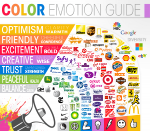
Colours make a big impact and you can improve your banner ad design by using the rights colours in the right way. Gregory Ciotti wrote a great article about Psychology of colours in marketing and branding, which gives an insight into how important it is and how you can benefit from it in your ad campaigns.
Different colours will make the audience of your banner ads feel different emotions. Therefore it is important to choose colours that represent your brand, but also make people feel things that fit with who you are and what your product or service is. That relation is actually more important than the colour itself.
Take a look at the Colour Emotion Guide above – does the related emotion of your banner ad colours fit with what you and your product stand for? By spending some time thinking about what message or emotion you are trying to convey to your view you can improve your banner ad design.
4. Improve Banner Ad Design with Better Copy
There are some points to keep in mind when writing your banner ad copy. As I mentioned earlier in this post, you always need to remember the goal and purpose of your ad. This also applies to the copywriting. What is the purpose and what is the message you are trying to convey?
According to Emilie Futterman’s post on The Next Web, it’s important to keep the copy simple and un-cluttered. Avoid flashing or flickering designs and instead go for a lean, limited and strong copy. Keep in mind that people don’t have much time so the less for them to read, the better.
Final Thoughts
We can see that it’s not necessary to make really big changes in order to improve your banner ad design. Even small changes are enough to make improvements and you will soon see results. It is also worth testing different designs back and forth and you will notice what works the best for you!

