Great news! You’ve created a great banner advertisement that was well placed and was enticing enough for potential customers to click on it. However, it is now crucial that you follow through with an excellent landing page, or indeed several landing pages, that converts visitors into customers.
A landing page is any web page that appears when a visitor clicks on an online ad. However, the landing page is usually specifically designed to guide visitors to the intended conversion goal usually through some sort of offer.
We have outlined 7 tips that you should consider when creating your most effective landing page. By using these tips in combination with the right tool to create banner ads and BannerFlow’s easy-to-use drag & drop landing page builder, the building, tracking and integrating of launch pages will be quick, easy and effective.
1. Plan your page
By spending time planning your landing pages you will create a page that fulfils its purpose better than something that is thrown together quickly with little thought. Brainstorm ideas, think about what you want to achieve from each page, what you are offering, and whom you are targeting.

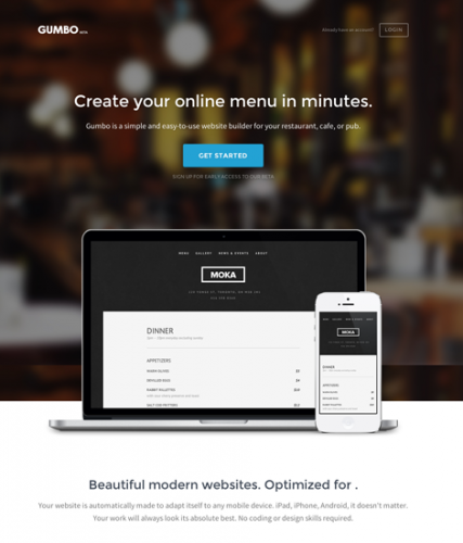
This landing page from Gumbo clearly shows the product and what it does. The good composition of this page is clearly down to good planning.
2. Don’t just direct all your traffic to your homepage
It may seem easier to direct all traffic to your glossy homepage but this method is ineffective and yields little in terms of leads. For each call to action you should have a specially tailored landing page. According to Hubspot, businesses with 31 to 40 landing pages got 7 times as many leads than those with only 1 to 5 landing pages. Given these numbers it seems only logical to create a series of tailor-made landing pages.

3. Keep it Clean
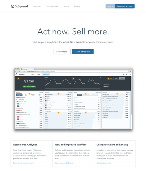
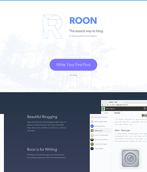
The design of your landing page is crucial. Make it simple and functional. According to MarketingSherpa 16% of landing pages are free from navigation bars. By keeping free from unnecessary clutter, you can avoid visitors becoming distracted and leaving your landing page before leaving their details.

4. Keep it Clear
Your visitor has clicked your advertisement because they have seen an offer that interests them whether it be a free ebook or free trial of your product. Reaffirm what you are offering on your launch page, preferably using the same copy as you did on the online advertisement. Also make it clear who you are: include your logo and other branding elements and exciting high-quality content that describes what you offer. This landing page from Munchery below demonstrates this well:

This Munchery landing page clearly shows who they are, what they do and an exciting offer; there is no room for confusion and a well thought out contact form makes it easy for people to sign up straight away!
5. Make Conversion Easy
In return for the free trial or download of an ebook you will want some information in return. The best way to achieve this is by asking for some personal details through a form. Keep these forms short and sweet with the aim of getting only the basic information. Be careful not to scare off visitors with long daunting forms that ask too much. By allowing visitors to submit their details though Facebook or Google+ you can make it easier for your visitors to retrieve the offer and thus it becomes more enticing.

This landing page from Frank & Oak gives visitors the chance to sign up using their Facebook account, making conversion a lot easier!
6. Make it shareable
By simply adding a sharing widget on your landing page, this opens up the possibility for visitors to your landing page to share what offer they have just taken advantage of. This helps extend your reach online and could lead to more sales and customers.
7. Say Thanks!
Saying thanks is simple but it makes people feel appreciated. Show the world what sort of company you are by adding a quick thank you page after the visitor has signed up to your offer. This thank you page can also help guide visitors to your homepage or other related content that your audience might find interesting or useful.
The Bottom Line
Ultimately, by using good practice tips and experimenting with a variety of different landing pages and using an effective tool to create the landing pages is the best way to see what works best for your business. You should focus on creating a clean design that clearly shows your brand and what you are offering. However, don’t forget that content is king, so make sure that your landing page includes remarkable content to make conversion easy.
What are your experiences of using and creating landing pages? What problems have you encountered whilst creating landing pages? What good practice tips do you have? Tell us in the comments below, or start a conversation with us on Twitter!


