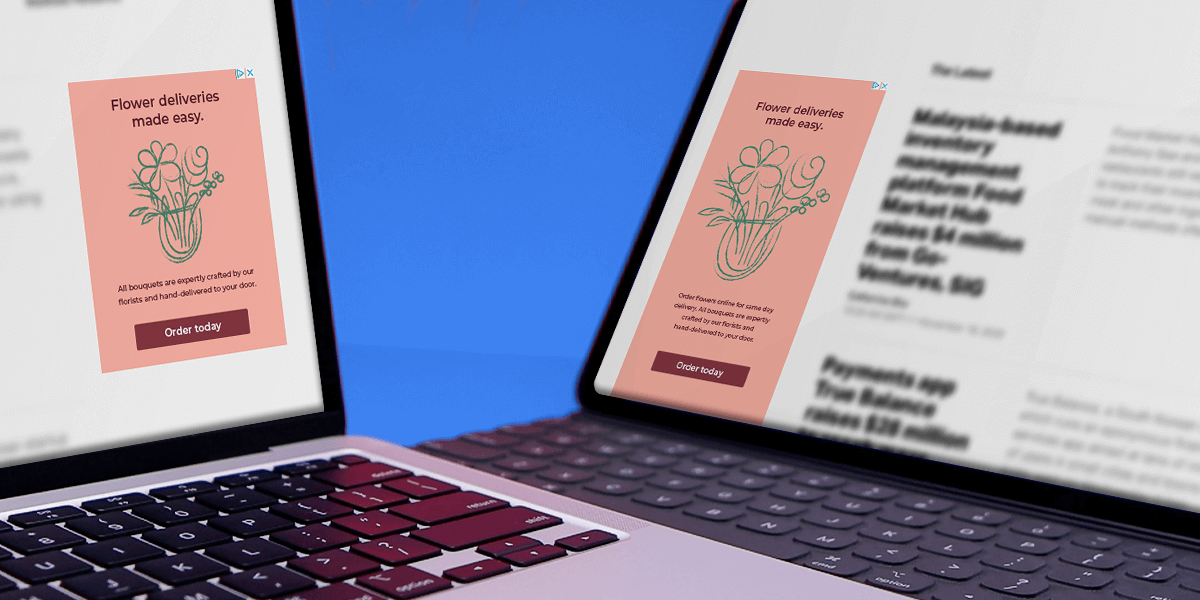
Good design is vital to creating a banner ad that people will click on. This short guide will lead you through the planning and work process that is required to design a remarkable display ad.
Effective banner ad design
In order to design a banner ad, you need to look at the workflow as a whole process. The process of a successful banner ad campaign starts from the planning of the campaign and banner ad and ends at the closing of a sale or the intended overall goal of the banner ad. Knowing how to design a banner ad is only one component for creating an effective banner ad campaign. Other elements such as placement and creating effective landing pages are also important. This guide will focus on how to design banner ads.
Planning your banner ad
We’ve all heard the cliché fail to plan, plan to fail, haven’t we? This cliché is particularly true when designing banner ads. You should spend at least as much time planning your banner ad campaign as you do actually design your banners. Planning will help you form concrete aims, goals, and ideas that will lead to better-executed banner ad campaigns, higher click-through rates, and better sales. Here are the questions you should ask yourself and things you should think about when planning your banner ad campaign:
What is my goal of my banner ad?
Defining your overall goal is important when you design a banner ad. Without a goal, your banner ad will be nothing more than a pretty click-through picture. Here it is essential to think about the overall process.
The goal of the banner ad is not simply for viewers to click on it. Your goal of your banner ad should be to increase conversions, build brand awareness, or get people to buy or download a product. Establish your goal first and build your banner ad campaign around this end goal.
Who is my banner ad target audience?
Next, you should think about your target audience. You should ask yourself: who is my target audience? What do they want? What are their needs and problems? What will make them click a banner ad?
Most of these questions should be relatively easy to answer as you should know who your customers are. However, if you are creating a banner ad for a client, you should make sure you know who they are targeting the banner towards. Spending time researching your target audience will ensure that you do not completely miss the mark and create a banner ad campaign that fails.
What information and resources do I need?
Finally, you should think about what information and resources you need in order to create your banner ad. You should decide what sizes you’re are going to make, how many different versions and different languages the banner needs to be in. You should also decide if your banner ad is going to be made in HTML5 or flash or both. Once you have found out this information you need to plan what resources you need for example, do you need designers or do you need to find someone to translate the banners into different languages? You should also find out when your deadline to create the banner is and how much time that you’re going to spend on the project.
Writing copy for your banner ad
The copy is important when you design a banner ad because allows your to communicate your offer clearly to your audience. The key rule here is: keep it short, sweet and to the point. Face it, viewers do not want to read line after line of text, regardless of how good the writing is. So keep it short.
What is the message you’re trying to portray? This should be your key thought when you’re writing the copy for your banner ad. Think back to the overall goal of your banner ad and base your copy on this. If you are offering a discount use enticing copy such as ‘Sale! -70%’ that clearly states what you are offering.
When writing copy you should also remember that your spelling and grammar should be good, and if you are translating your banners into a variety of different languages you should make sure that the copy works and is equally effective in all the different languages: don’t just rely on translation websites, get someone who knows the language to check the copy!
Visual elements on your banner ad
The visual aspect of your banner ad is arguably one of the most important elements to think about when you design a banner ad. There are several visual elements to look at when improving banner ad design:
Colour usage in banner ad design
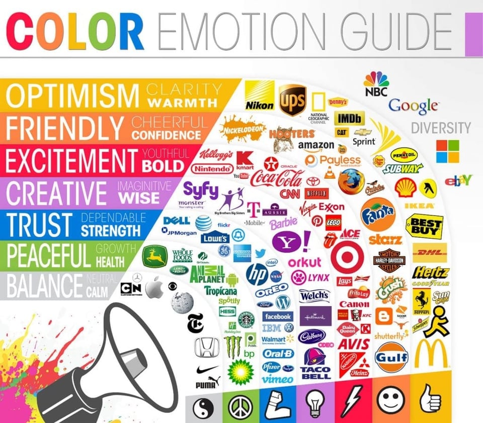
Firstly, you should think about colour and how you are going to use it. Different colours will evoke different emotions in the viewer, as demonstrated in the image below. Thinking about what sort of message you want to portray will help you choose the colours in your banner ad.
Infographic credit: The Logo Company
Secondly, when thinking about colour you should think about how you are going to use it. Too much colour can be distracting or uncomfortable to look at, yet too little colour might mean that you risk your banner ad not being eye-catching and therefore people will not click on it. Learn how to use white space effectively, this will help to improve your designs.
Using fonts in banner ad design
The visual aspect of your copy is also important. It is important to choose a font that is easily readable. Avoid using fonts that are too busy or cannot be easily read at a glance. The colour of your text is also important because this will help with the readability of your banner ad. Make sure your font stands out on your banner background. The same goes for font size and spacing. Text that is too small will be missed, and font that is placed too close together cannot be read easily.
Graphics and images in banner ad design
Images and graphics can be a great way to help make your banner ad more attractive and eye-catching for viewers. Keep your images relevant to your banner ad. If you own an e-commerce store, you might want to feature some of your products in the banner ad, for example, or if you own a car dealership you should feature some of your latest car models on the banner ad. Use images wisely, as with text and colours, don’t overcrowd your banner ad.
Decide if you are going to buy some images for a rich media banner ad or create you own. If you are buying images make sure that they are good quality and of course relevant. The same goes for creating your own images; they should be good quality, so think about if you have the right equipment and skills to create good images. If you upload poor quality homemade images into your banner ad you will risk people avoiding clicking on your banner because your company appears unprofessional or your products do not look appealing.
How to use animations effectively in your design
Animations are the final element of visual design you should take into consideration when trying to improve your banner ad design. Whilst animations can bring your banner ad to life if you try to be too adventurous with them you could end up with a very annoying banner that no one will consider clicking on. Keep animations simple; avoid flashing or flicking and opt for smooth transitions.
Alternatively, consider using video in your banner ad to create even greater impact, but remember to keep it relevant to your brand and your offer.
How to test your banner ad design
There is only one sure way to see if your banner ad design has improved, and that is by testing your banner ad. The best way to test your banner ads is to use A/B testing. This will allow you to try out two or more variations of your banner ad to see which one is more effective gaining click-throughs, leads, and sales. Then you can see which of your designs are most effective and continue to build successful banner ad campaigns. Also ask for feedback from colleagues, customers or your target audience in forums online. This will help you to make improvements on your banner ad and see what the general reaction to it is.
With a platform like Bannerflow producing remarkable display ads is easy.


